After watching over this film opening. "Prae Weissman" 's name needs to stay on screen for as long as the shot goes. I feel that the extreme close up shot of the eye after the close up on the hair dresser taking the scissor out from her pocket does not allow the story line to flow and it does not make much sense. Moreover the music stops before it should.
Friday, 30 January 2015
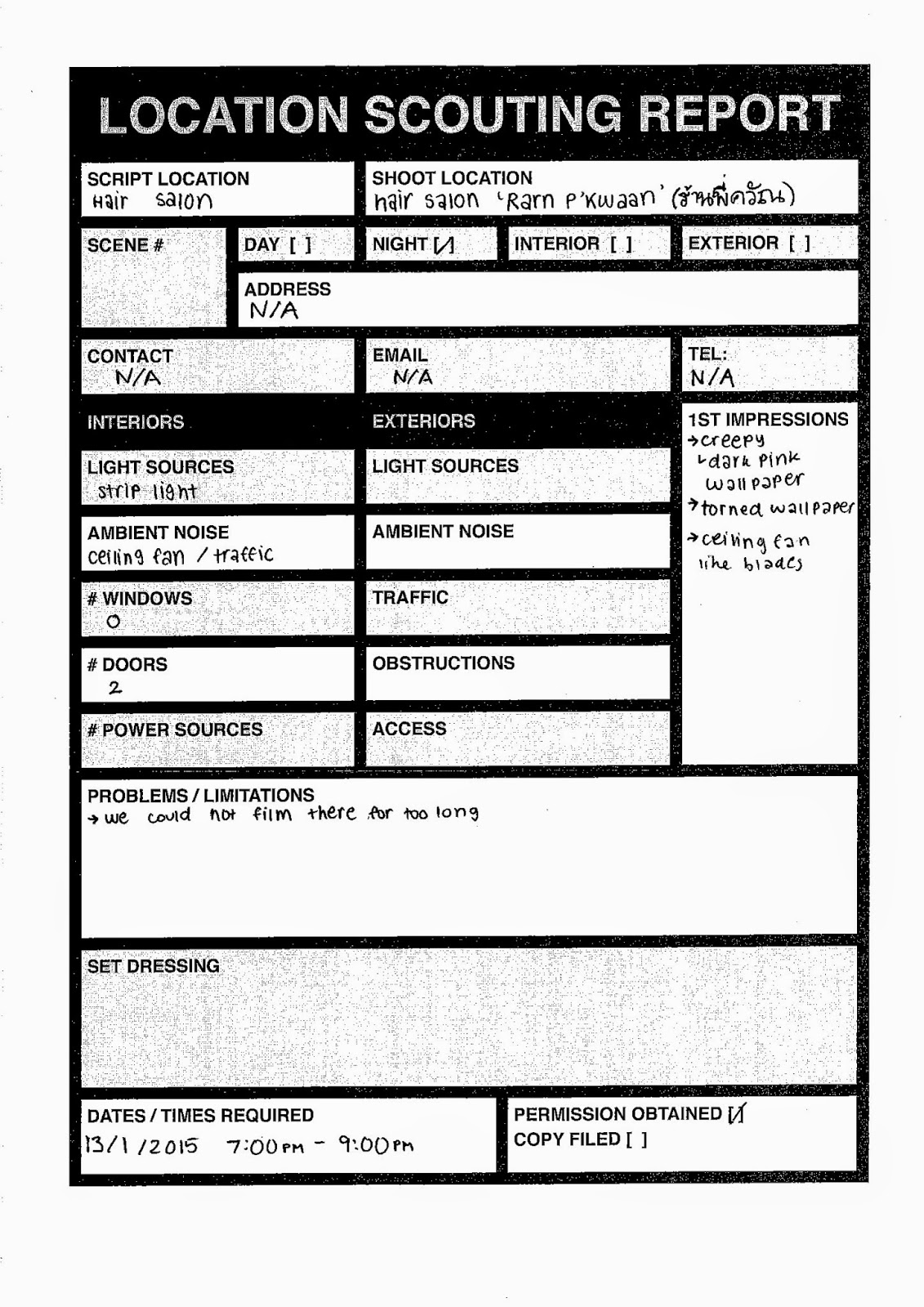
SNIP second draft
After watching over this film opening. "Prae Weissman" 's name needs to stay on screen for as long as the shot goes. I feel that the extreme close up shot of the eye after the close up on the hair dresser taking the scissor out from her pocket does not allow the story line to flow and it does not make much sense. Moreover the music stops before it should.
New Font Analysis

We stuck with the same font as before but added a different effect. The angular shapes that are seemingly cutting through the bold letters symbolises a disturbance within the mind of the hairdresser. It could also suggest that her insanity is episodic, allowing her to hide her obsession from the public eye. The other effect that we used was with the light, which gives off a hallucinatory quality, allowing the audience to somewhat see into the mind of the hairdresser and understand her on a deeper level through the same experiences (fantasies/hallucinations).

For the name of the production company, we decided on this font. Being half bold suggests, again, an episodic insanity and how easily the hairdresser can unknowingly slip in and out of the two states of mind, symbolising instability.

We changed the font of the credits to a typewriter font as we felt like it would hold more weight to the story since the previous font was too thin and looked like it could not really convey the story as well as this one. A typewriter font could suggest that the hairdresser is a perfectionist due to the fact that typewriters are much neater than if something was handwritten. As well as this, the slight slant to the font could also suggest that the hairdresser is making room in her mind for the obsession and it may soon completely take over.
Soundtrack Analysis
We chose to use the first minute and a bit of this clip.
- Disconnected, piercing sounds
- Constantly shifting stereophonic sound makes it sound like it's moving around like a mind that is lost
- Pitch drop at about 10 seconds could symbolise lowered brain power/decreased sanity
- Droning sound at about 30 seconds makes it feel like it's dragging on and will last forever
- Volume of sound varies constantly and randomly, suggesting that insanity leads to a disconnected, disordered mind without direction or purpose
Thursday, 29 January 2015
Title Design
Shapes
have a variety of characteristics,
each
conveying different messages to the audience.

ANGULAR SHAPES
Shapes with sharp
edges connotes a violent and threatening feel. This can be seen in animated
cartoons where the antagonists that have a more triangular face appear be cruel.

Circles or rounder shapes gives more of a feminine and friendly impression.
Most protagonists in an animated film usually have a round feature to their face.
Most protagonists in an animated film usually have a round feature to their face.

For the title, there are triangles and rectangular shapes running through the word 'SNIP' since it symbolises violence and can be referenced to a blade from a scissor. The light shining through contrasts a hairdresser shop's seemingly bright light compared to the night. This is represented once again with an establishing shot filmed outside where the hair dresser standing in her salon. The zooming effect embedded in the title represents the hallucinations by the eldritch hairdresser.
Monday, 26 January 2015
Snip Rough Cut Feedback
I worked on the "things that could be improved";
"hint of the killer/psycho"
I added a shot of the hair dresser pulling the scissor out in slow motion, so that it might suggest to the audience that the hairdresser has the ability to take their life away, she has got the weapon to do so in her hands and she using it next to the customer's necks. There are two scenes at the end where I feel that it suggests the morbidity and the composition of the shot is awkward, a disruption in the equilibrium and suggests death as the customer lied down, closing her eyes, she trusts the hairdresser and then a cut to the water whirling scene which is used in the movie "Psycho" and "Dexter" which suggests the mental instability of the main character and the psychological genre. Moreover this scene can suggest the uncertainty of the customer's life.
"Font too tmblr"
I do agree that the font used here is too fashionable and modern which does not go along well with the setting and the tone we are trying to set. Therefore I changed from "basic title" to something similar to a "courier" which is a typewriter style font, it gives a robust and neat but at the same time dirty, just like the salon.
Character Research
Obsession: the state of being obsessed with someone or something
We drew some of the elements of each of these characters together to form the character of the hair dresser.
Jean-Baptiste Grenouille - Perfume: The Story of a Murderer (2006)
Grenouille was born in a fish market in Paris with hyperosmia, an abnormally strong sense of smell, which eventually leads to him becoming a serial killer. Over the course of the film, Grenouille is taught a method of distillation and the preservation of scents. Since he was born with no scent, Grenouille decides to create the perfect perfume to prove his worth, killing women whom he deemed had the perfect scent and attempting, and failing many times, to capture their scent.

Jame Gumb (Buffalo Bill) - The Silence of the Lambs (1991)
Gumb was born in California and abandoned by his mother, then taken into foster care at the age of two. In the movie, Lecter summarizes Gumb's life as so: "Billy was not born a criminal, but made one by years of systematic abuse." Later on in his life, Gumb becomes obsessed with wanting to become a woman but being too disturbed to qualify for gender reassignment surgery. Thus, he kills overweight women so he can skin them and create a "woman suit" for himself.

Francis Dolarhyde (The Tooth Fairy) - Red Dragon (2002)
Dolarhyde was born in Missouri and abandoned by his mother, then cared for in an orphanage until the age of five when he was taken in by his grandmother, who subjects him to emotional and physical abuse. As a result, he began torturing animals at an extremely young age to vent his anger. Dolarhyde begins his killing spree by murdering two families. He becomes obsessed with the Red Dragon, having a large tattoo of a dragon on his back, and believes that, by killing people - "transforming" them, he calls - he can fully "become" the Dragon. He also has two sets of false teeth; one for his normal day-to-day life and the other, which is distorted and extremely sharp for his killings, in which he earned the nickname "The Tooth Fairy."

Sweeney Todd - Sweeney Todd: The Demon Barber of Fleet Street (1936/2007)
Todd is a barber who dispatches his victims by pulling a level as they sit in his barber chair, causing them to fall backwards down a trapdoor into the basement of his shop, breaking their necks or skulls. In case some of his victims survive the fall, Todd goes to the basement and "polishes them off" (slitting their throats with his straight razor).

Gollum - The Lord of the Rings Trilogy (2001-3)
Originally known as Smeagol, a hobbit of the Shire, he became corrupted by the One Ring, which he found at the bottom of a river by chance. The Ring, which Gollum referred to as "precious," extended his life for another 400 years. Under centuries of the Ring's influence, Gollum became obsessed with it and after Bilbo Baggins found the Ring and took it for his own, Gollum pursued it for the rest of his life. His obsession is further highlighted at the end of The Return of the King (2003) when he willing fell into the fires of Mount Doom just to be reunited with the Ring.

We drew some of the elements of each of these characters together to form the character of the hair dresser.
Jean-Baptiste Grenouille - Perfume: The Story of a Murderer (2006)
Grenouille was born in a fish market in Paris with hyperosmia, an abnormally strong sense of smell, which eventually leads to him becoming a serial killer. Over the course of the film, Grenouille is taught a method of distillation and the preservation of scents. Since he was born with no scent, Grenouille decides to create the perfect perfume to prove his worth, killing women whom he deemed had the perfect scent and attempting, and failing many times, to capture their scent.
Portrayed by Ben Whishaw
Jame Gumb (Buffalo Bill) - The Silence of the Lambs (1991)
Gumb was born in California and abandoned by his mother, then taken into foster care at the age of two. In the movie, Lecter summarizes Gumb's life as so: "Billy was not born a criminal, but made one by years of systematic abuse." Later on in his life, Gumb becomes obsessed with wanting to become a woman but being too disturbed to qualify for gender reassignment surgery. Thus, he kills overweight women so he can skin them and create a "woman suit" for himself.
Portrayed by Ted Levine
Francis Dolarhyde (The Tooth Fairy) - Red Dragon (2002)
Dolarhyde was born in Missouri and abandoned by his mother, then cared for in an orphanage until the age of five when he was taken in by his grandmother, who subjects him to emotional and physical abuse. As a result, he began torturing animals at an extremely young age to vent his anger. Dolarhyde begins his killing spree by murdering two families. He becomes obsessed with the Red Dragon, having a large tattoo of a dragon on his back, and believes that, by killing people - "transforming" them, he calls - he can fully "become" the Dragon. He also has two sets of false teeth; one for his normal day-to-day life and the other, which is distorted and extremely sharp for his killings, in which he earned the nickname "The Tooth Fairy."
Portrayed by Ralph Fiennes
Sweeney Todd - Sweeney Todd: The Demon Barber of Fleet Street (1936/2007)
Todd is a barber who dispatches his victims by pulling a level as they sit in his barber chair, causing them to fall backwards down a trapdoor into the basement of his shop, breaking their necks or skulls. In case some of his victims survive the fall, Todd goes to the basement and "polishes them off" (slitting their throats with his straight razor).
Portrayed by Johnny Depp
Gollum - The Lord of the Rings Trilogy (2001-3)
Originally known as Smeagol, a hobbit of the Shire, he became corrupted by the One Ring, which he found at the bottom of a river by chance. The Ring, which Gollum referred to as "precious," extended his life for another 400 years. Under centuries of the Ring's influence, Gollum became obsessed with it and after Bilbo Baggins found the Ring and took it for his own, Gollum pursued it for the rest of his life. His obsession is further highlighted at the end of The Return of the King (2003) when he willing fell into the fires of Mount Doom just to be reunited with the Ring.
A CGI character voiced and performed by Andy Serkis
Font Analysis

For the title, we chose this font because of how it looks as well as its symbolic connotations. Its boldness could suggest the main character's confidence in her ability to hide away her obsession from the public eye while the black splashes on the white characters could symbolise the deterioration of her mind and how insanity will ultimately stab her in the back and expose her when the obsession becomes too strong to control.

For the credits, we chose this font because of it creates a stark contrast with the title. Its thinness could suggest the main character's (the hairdresser) thinning sanity and how she is slowly but surely falling and succumbing to the darkness that lurks in her head. Since the font is all capital letters, it could symbolise the forcefulness of this obsession with hair. Not only is the hair dresser becoming insane, she is subconsciously forcing herself to fall further down. This is why we feel that this font was the best in order to convey the overall atmosphere of the opening as well as the main character's state of mind.
Friday, 23 January 2015
SNIP (first version)
After watching this over and over again. I thought that the 'film opening' that we made does not look and the story line does not develop as smoothly as I hoped.
The progression of this film opening is very crooked. It seemed more like a short film rather than a film opening. Since there was too much going on with customers going in and out of the salon. Moreover we spotted that the shot where the customer supposedly goes out of the salon, in the shot the door that was reflected in the mirror does not have a customer going out. By cutting customers going out of the salon scene also creates more enigma to the film opening of whether the customer left or is still in the salon.
Character representation was too bold in this first version in the establishing shot where she stood and waits for customers and says "welcome". However, we wanted to set a subtle and ominous tone that the hair dresser would seem normal, the customer would not know her true identity, having a hair fetish. This will make the audience feel edgy whether the customer would know and protect themselves or not. Therefore I relocated the scene and cut the hand held and "welcome" scene out as it is too bold and somewhat like an ending of a short film, instead of leading the audience to the actual film.
Shadow scene is removed because it looked too peculiar as if it is an art movie playing with shadows.
The panning shot at the beginning is also removed because it is not necessary in creating and setting up of tone.
The new opening scene will be shorter with a smoother flow and a better title effect as this title does not stand out and does not feel cinematic. The progression of this opening film will give more clues and hint in the character without giving away too much information that there are no enigmas. Shots are rearranged so that everything makes more sense all together,
Thursday, 22 January 2015
22.1.2015
Today we finished filming. Due to time constrains and short in people we decided to combine two shots together and playing with the shadow and reality. I am in the process of editing the video, what I found most challenging today is using the effects to create the same tone for continuity.
Wednesday, 21 January 2015


21.1.15
After watching the rough cut critically over and over again. We all agreed that it does not have the codes and conventions of psychological thriller, it was more like romance. Therefore we decided to change the storyline and prepared everything within one day; story board, props, costume, make up and fonts.


Tuesday, 20 January 2015
Monday, 19 January 2015
Sunday, 18 January 2015


Thursday, 15 January 2015


Wednesday, 14 January 2015
14.1.2015
Today we decided as a group for the production name text effect, the movie title text effect and the credits effect. Yesterday I was searching for tutorials online and found these two interesting tutorials on text effects which suited with our storyline and production name. The production name would be the butterfly animation, since our group has only girls in it it symbolises our fragile but intimidating beauty which will be portrayed in our coursework, our production name is 'Vivian' means book in Latin, I wanted to try and make the butterfly like a cut out from the book (if its possible) to show base of our knowledge which is applied to our work to create a unique beauty. The title would be the smoke effect, since our story line is about loss and Emmet loosing his girlfriend so the smoke symbolises how his girlfriend was the light to his life but her absence made his life dark and gloomy.
butterfly animation
smoke animation
Tuesday, 13 January 2015
13.1.2015
Today I edited the prop video, using premiere and after effects. Yesterday the 12th of January Prae and I went to Chatchujak Market to buy the props we need including three cacti in a white pot, a fake gun and mugs (generic colour; faded pink and blue). However, Chatchujak is a weekend market, so we have to go to Siam and find a place to buy the props. We can only find mugs that are suitable and asked to borrow Koji's fake gun. On Wednesday my aunt will buy me three cacti at the chatchujak flower market in the afternoon.
Monday, 12 January 2015
12.1.2015
Today I edited the vlog on location survey we did on saturday 10.1.2015 where we go to researched hotel, which were considered suited for our coursework's venue, through BTS, taxi and our own feet we managed to survey all the hotels listed, although two hotels (lub D siam & Centre Point Platunam) is fully booked and are not open for survey.
We also collaborated in changing the opening scene. The bath scene and the night scene into morning scenes where every morning routine reminded him of 'her'. The last scene Emmet grabs his suite and the gun falls to the ground it flashes back to him pointing the gun to the camera. The amendment was made since it will create enigma and it sounds more like an opening scene rather than a short movie.
We also collaborated in changing the opening scene. The bath scene and the night scene into morning scenes where every morning routine reminded him of 'her'. The last scene Emmet grabs his suite and the gun falls to the ground it flashes back to him pointing the gun to the camera. The amendment was made since it will create enigma and it sounds more like an opening scene rather than a short movie.
Saturday, 10 January 2015
10.1.2015
LOCATION SURVEY
We went out to survey for the perfect location for our character's bedroom scene. Since he lost his girlfriend his life becomes dull, therefore we were focusing more on black and white colours and thick curtains as he shuts himself out of the world as he morns for his girlfriend's absence these are the panoramas of each location.
LUXX XL HOTEL

ADELPHI HOTEL

BEAT HOTEL

A very artistic hotel, each room is painted by different thai artist and has different theme and style varies with each artists. we looked at three rooms. The first room has a cute style with a sky blue coloured wall creating a relaxing atmosphere, this was way off our theme although it is very nice. However, the two other rooms were painted and designed by another artist with black and white elements, this was exactly what we were finding. The bigger delux room has everything we need, the coffee table and a counter next to it for our morning routine scene. The curtains were thick therefore we can play with the lighting more easily and further symbolises the character shutting the world out. Not only it is a perfect fit with our plan but shooting there was free of charge therefore we choose this beat hotel.


Thursday, 8 January 2015
8.1.2015
Researched on sound track, exploring the top 10 psychological thriller from IMDb listening and identifying how each one of the movie's soundtrack creates this spooky, eerie and uncomfortable feeling to the listener.
Wednesday, 7 January 2015

Font Research

Possible fonts
- Novecento Wide
- Telegrafico
- Skyfall
- Supernatural Knight
- Edition
- Nue Gothic
- Trajanas Bricks
- Code
- Pistara
-Tan
HOME
There is something about this place. Something about the
unforgiving cracks along the pavements, or how the way the city lights up in
the most unrelenting way. The routine of getting up at five in the morning just to
beat the traffic on the way to work, the good morning kisses that she plants on my forehead just as she leaves for work, the way the imprint of her kiss
lingers all day. The way she would add half a cup of milk into her coffee,
because that’s the way she always loves it. The way she always smells like a blend of vanilla and raspberries.
Somehow this place, this place never lets me forget my past, and all I
want to is be apart of its future; her future. Every crack, every corner about
this place gives me inspiration. I don’t feel like I need anything else at all,
except to just be here experience more of this place, with her. Together.
Only a few places make you feel this way.
There’s something about this place.
This is home.
She is home.
By Prae
Subscribe to:
Posts (Atom)